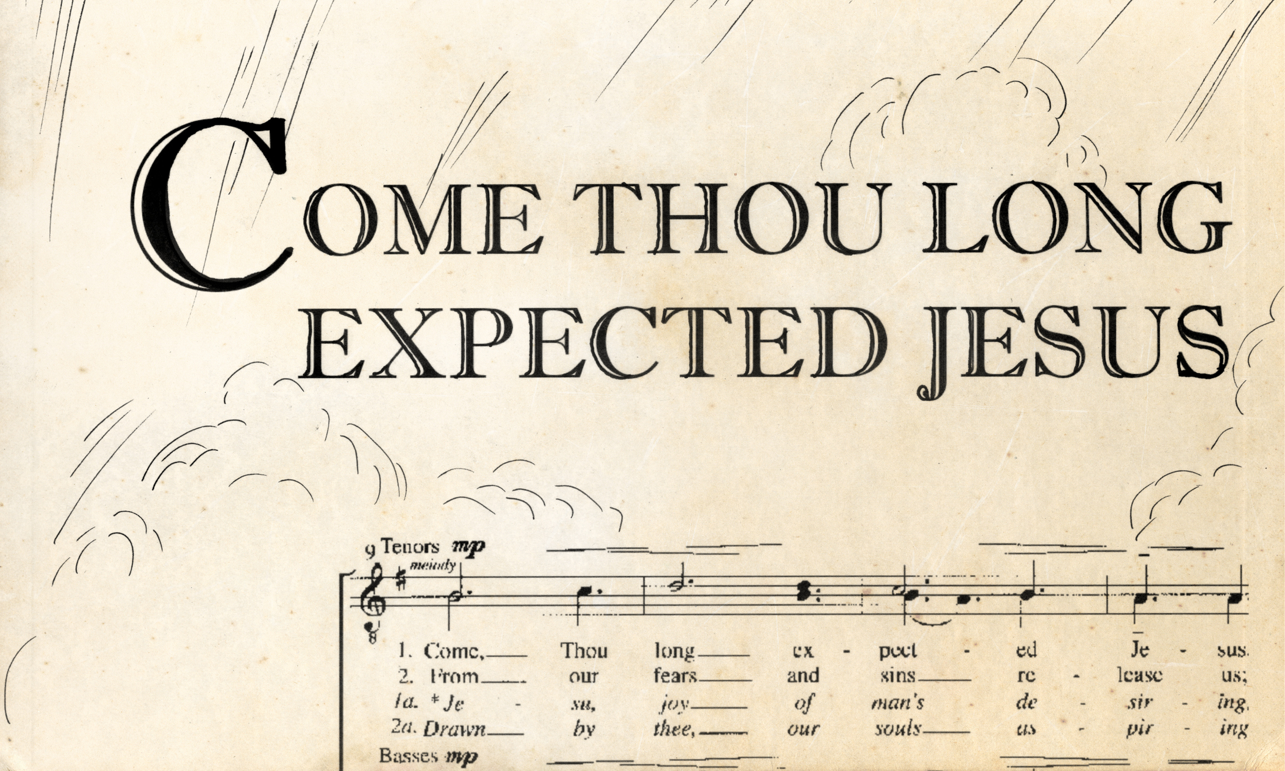
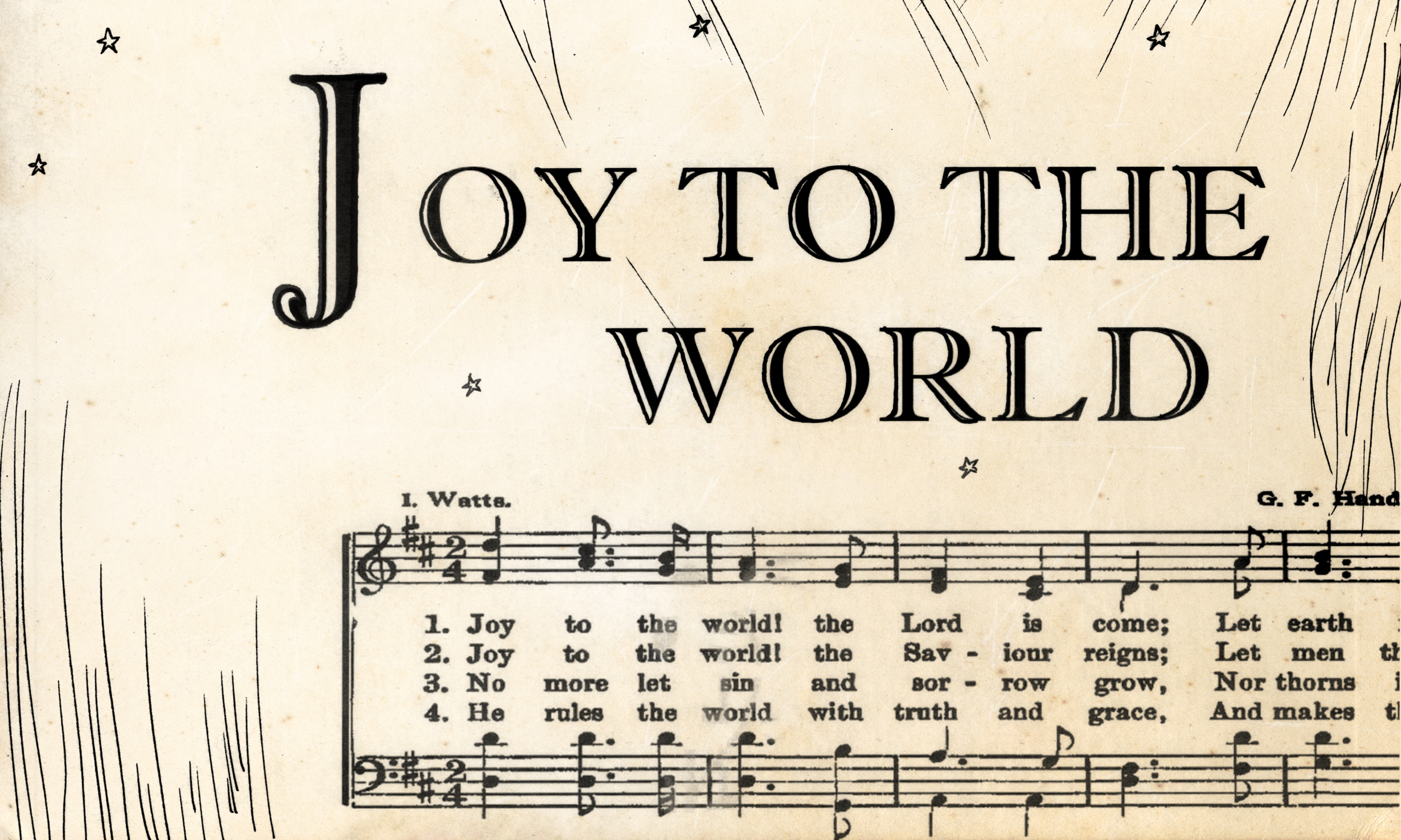
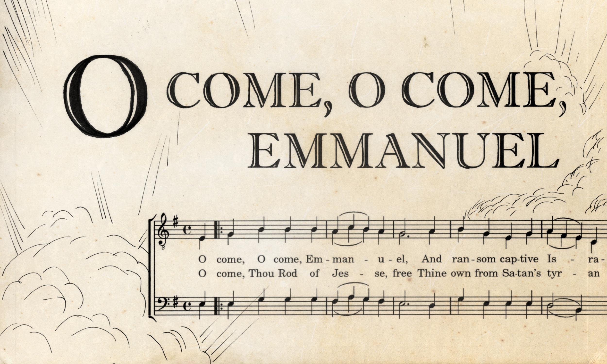
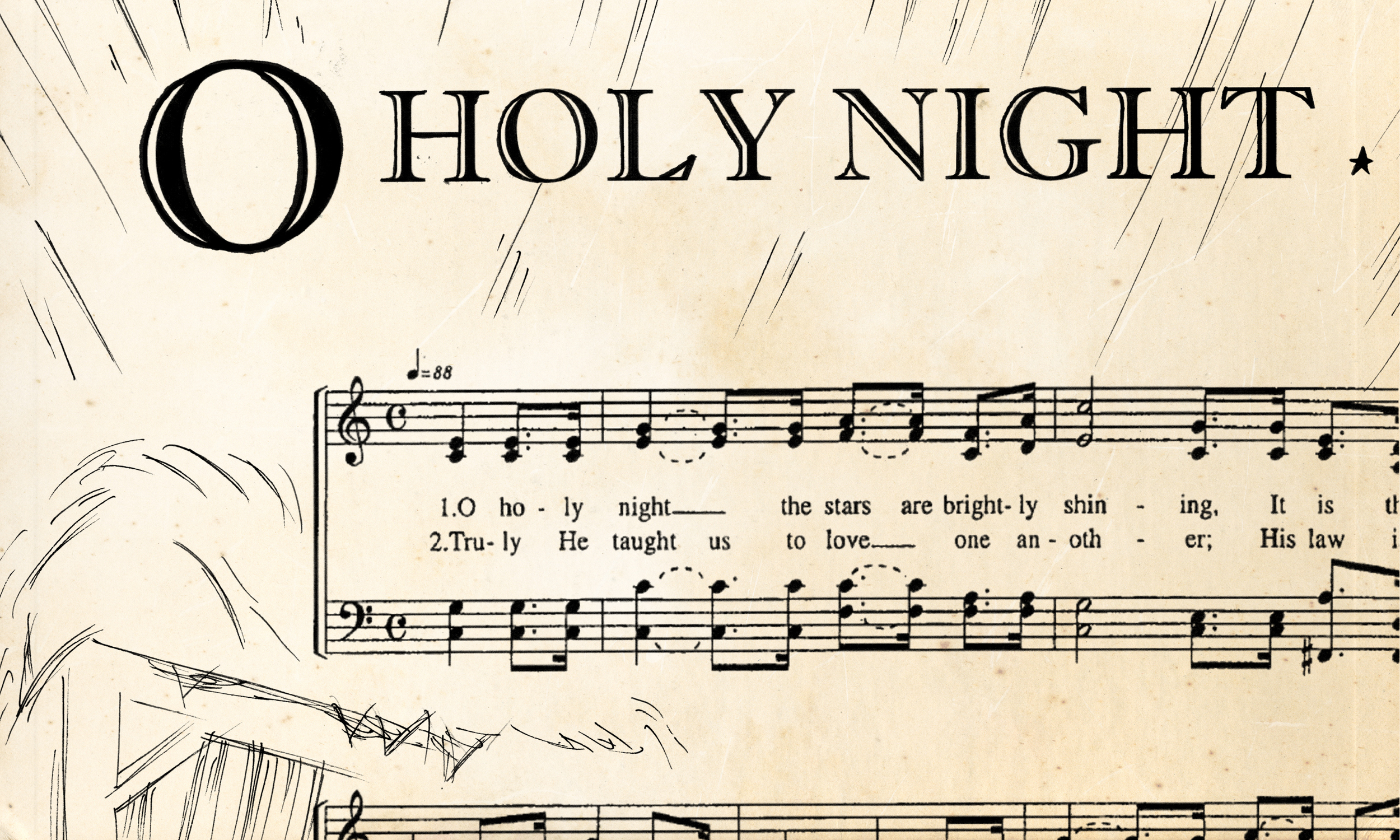
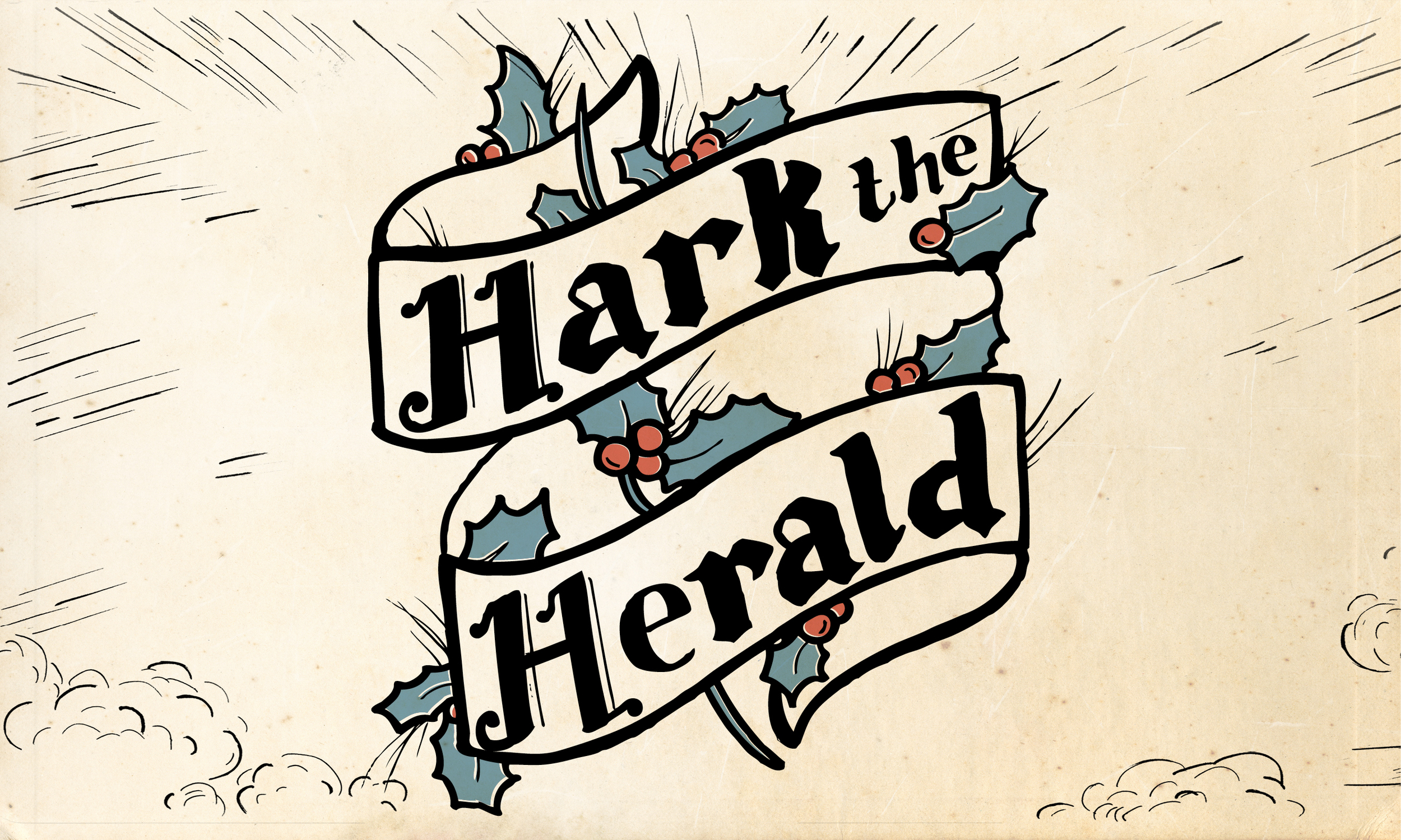
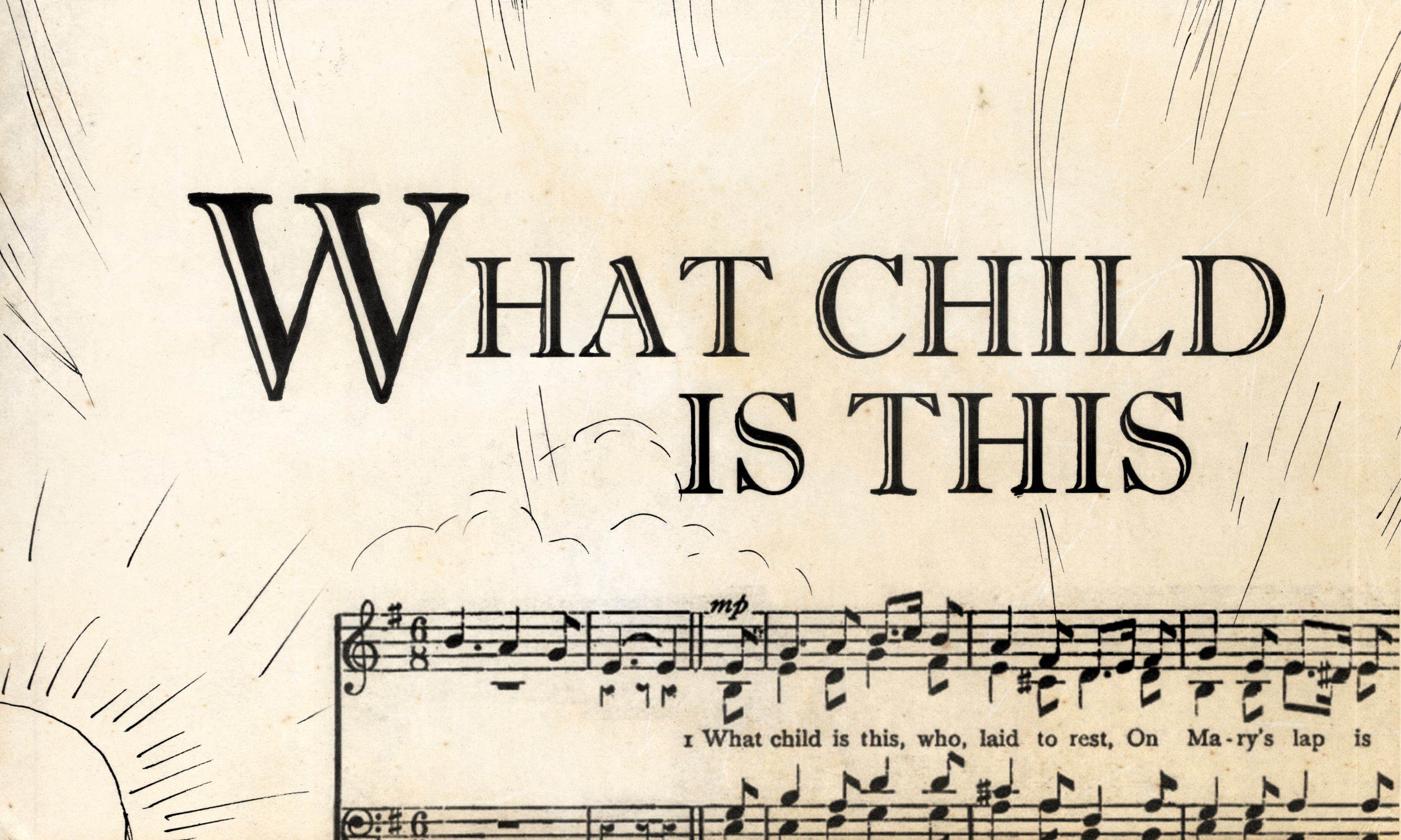
What is the vision behind the ‘Hark the Herald’ sermon series artwork?
The vision for all the art we do is to simply engage us more deeply with the Gospel. Since this season we’re focusing on beloved songs which have a much richer and deeper theological history than we often realize, we wanted to create something simple and familiar that would help draw us in to see the song in a new light. Inspired by vintage songbook illustrations, Liz and Justine created hand drawn scenes and lettering (for both the graphics and chalk wall) that focus on the notes and lyrics of the songs.
What does the process of creating the art look like?
For this one, after the initial creative team meeting to discuss the big ideas, we met as a design team to work on a concept. Typically one person would create the whole set of graphics, but we’re trying now to work more as a team, so we divided the responsibilities: Liz drew the illustrations, Justine did the title lettering, and I (Tim) did the final polishing in Photoshop (adding aged effects, etc.). Justine handled the chalk wall, and I’m sure her process is more exciting than mine.
What is your favorite aspect of creating the artwork for each sermon series?
I really enjoy the challenge of making something that speaks to the message of the Gospel, but isn’t the main thing. What we do is ancillary—it’s important and necessary, but always points to something more important. There’s an awesome freedom in that as an artist and as a believer.

